Methods
User-Centered Design, User Interviews, Competitive Research, Heuristic Analysis, Competitive Matrix, Affinity Mapping, User Persona, Site Mapping, Design Studio, Sketching, Wireframes, Agile Scrum, Prototyping, Usability Testing, High Fidelity Mockups
My Role
UX Researcher
UX Designer
User-Centered Design, User Interviews, Competitive Research, Heuristic Analysis, Competitive Matrix, Affinity Mapping, User Persona, Site Mapping, Design Studio, Sketching, Wireframes, Agile Scrum, Prototyping, Usability Testing, High Fidelity Mockups
My Role
UX Researcher
UX Designer
Tools
Figma
Sketch
Google Workspace
Canva
Team
Matt Lillis
Seo Young Oh
Phil Cote
Figma
Sketch
Google Workspace
Canva
Team
Matt Lillis
Seo Young Oh
Phil Cote
What is True & Faithful?
True & Faithful connects shelter dogs with people looking to adopt. As part of the initial research, we tested potential users to ask about their experiences with rescue websites. My assumptions led me to believe that the users would have typical problems with usability; the graphics, navigation and user interface, but I learned something very important behind all of that I didn’t expect: because of usability issues they felt like the websites weren’t legitimate and couldn’t be trusted. This realization helped guide the rest of our design process because we knew that we had to make the new design user-friendly but we also had to make it credible. Designers say that good design is invisible because the user doesn’t notice it, but I think good design is also trustworthy because it looks familiar and doesn’t ask too much of the user.
Research
So how do we redesign the website and how do we make it credible? In UX design we start with interviewing potential users to get an idea of the challenges they might be having with rescue websites in general. We found that the users were having trouble finding the information they needed from rescue websites. The observations from those interviews become insights and define what is called a Persona, or the archetypal user of the website. The Persona helps guide our research and make it human. We are solving design problems for people and the Persona represents those people. Meet Heather;

User Persona
Heather helps us understand the journey the she goes through on the website, the tasks she is trying to complete and her goals. When we know the journey and we know the challenges, we can get insight into what is important to the user in this experience. Heather wants to adopt a dog to keep her current dog company, but she’s having trouble finding the information she needs on rescue websites.

Journey Map

Why is gaining this insight important? Because now we can uncover the underlying issues that hinder our users from completing their tasks. We call this the Problem Statement.
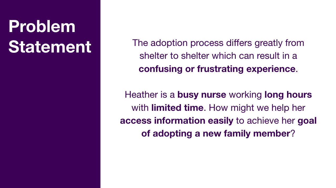
Now that we know who our Persona is and the high-level issues that she is experiencing, we can conduct user testing on the existing True & Faithful website to gain further insight into how we can make the experience of that website better for Heather.
True & Faithful is a non-profit dog rescue organization, so they likely have a limited website budget. What we found is that the website is graphically difficult to read and that it requires the user to go to another website to look at available dogs (without instructing them to do so). In the instructions the website does have, it tells the user to download and email an application, but the email links to a different website altogether.
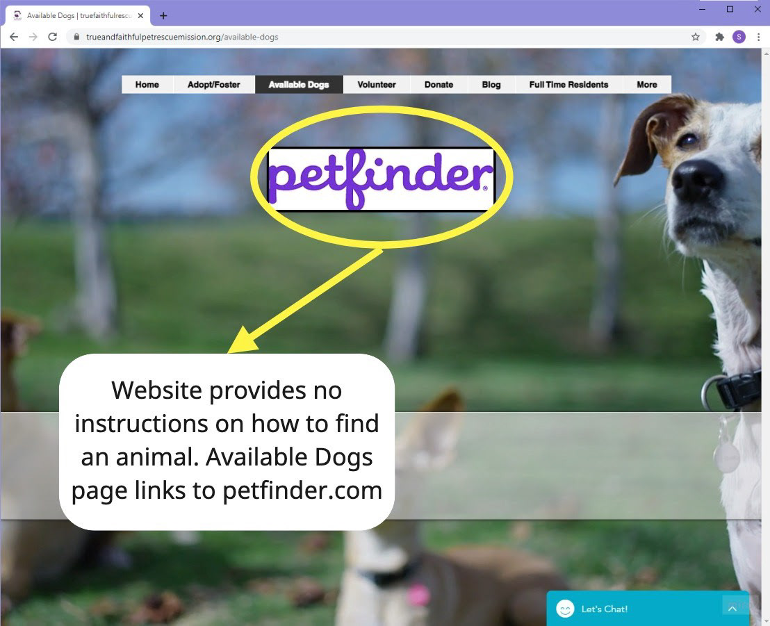
Heuristic evaluation and user testing on the original site.
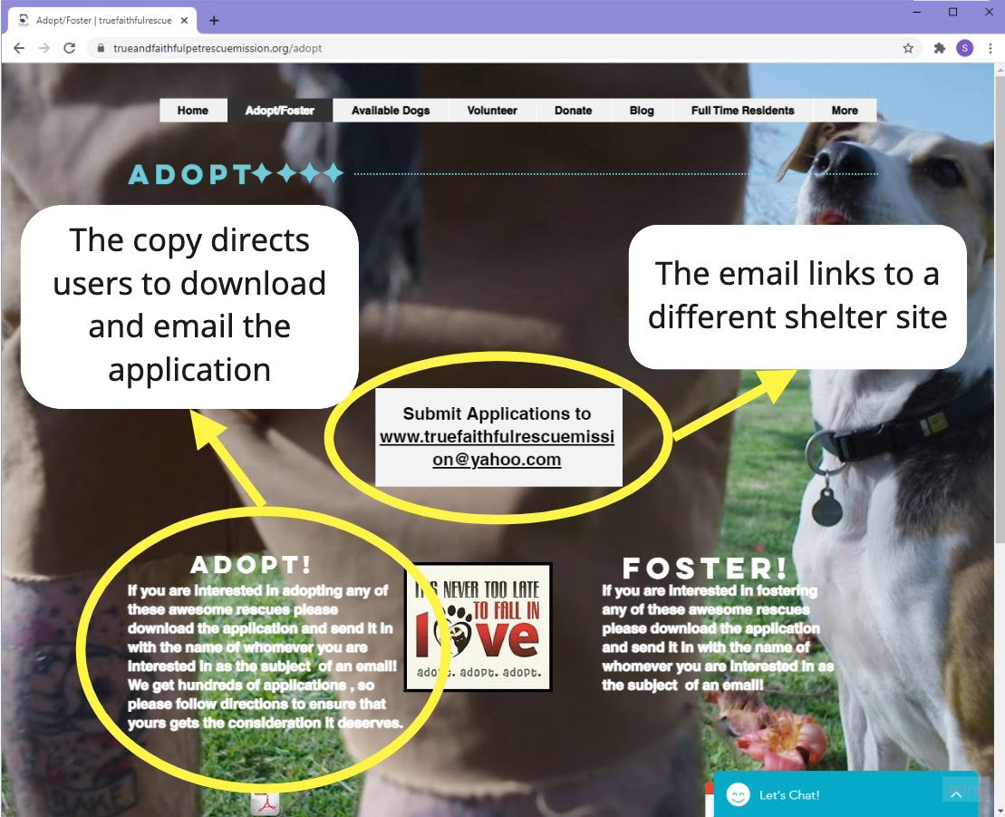
Testing revealed issues with the original website.
In testing, 3 out of 4 users failed when tasked to complete the online dog adoption application. The design of the website lacks directions and clarity which can confuse and discourage the users. We found that the mislabeled links and lack of instructions were causing the users to get confused but also doubt the credibility of the website.
Now that we had done some user testing with the existing website we could begin to work on a redesign.
Redesign
How do we make this website a better experience for our Persona, Heather? We came up with a list of goals for our design studio workshop.

The main change we decided on during our studio is that the design should have the available dogs listed directly on the website to make it easier to navigate and more trustworthy. Heather is interested in adopting a shelter dog on a rescue website, she wants to see pictures of the dogs and she wants to know more about them. We also included a FAQ section to provide more information about the rescue and the adoption process.
We did quick sketches and compared them to see which design solution we would all agree on.
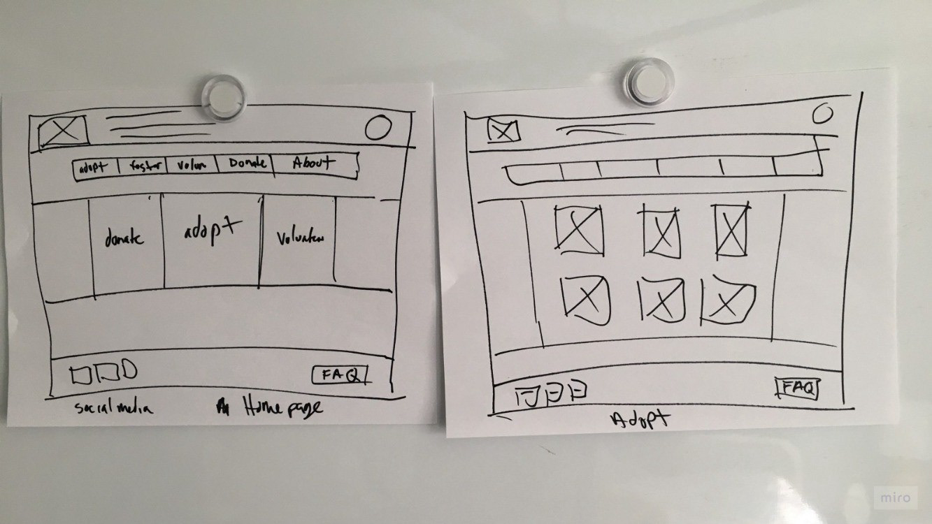
Sketching is a quick and inexpensive way to iterate design ideas.
We made a basic wireframe prototype and tested the design with potential users. With our new basic design including the dogs on the website, we found that 3 out of 3 users succeeded in completing the online adoption process.

Users succeeded in navigating the mid-fidelity wireframe prototype.
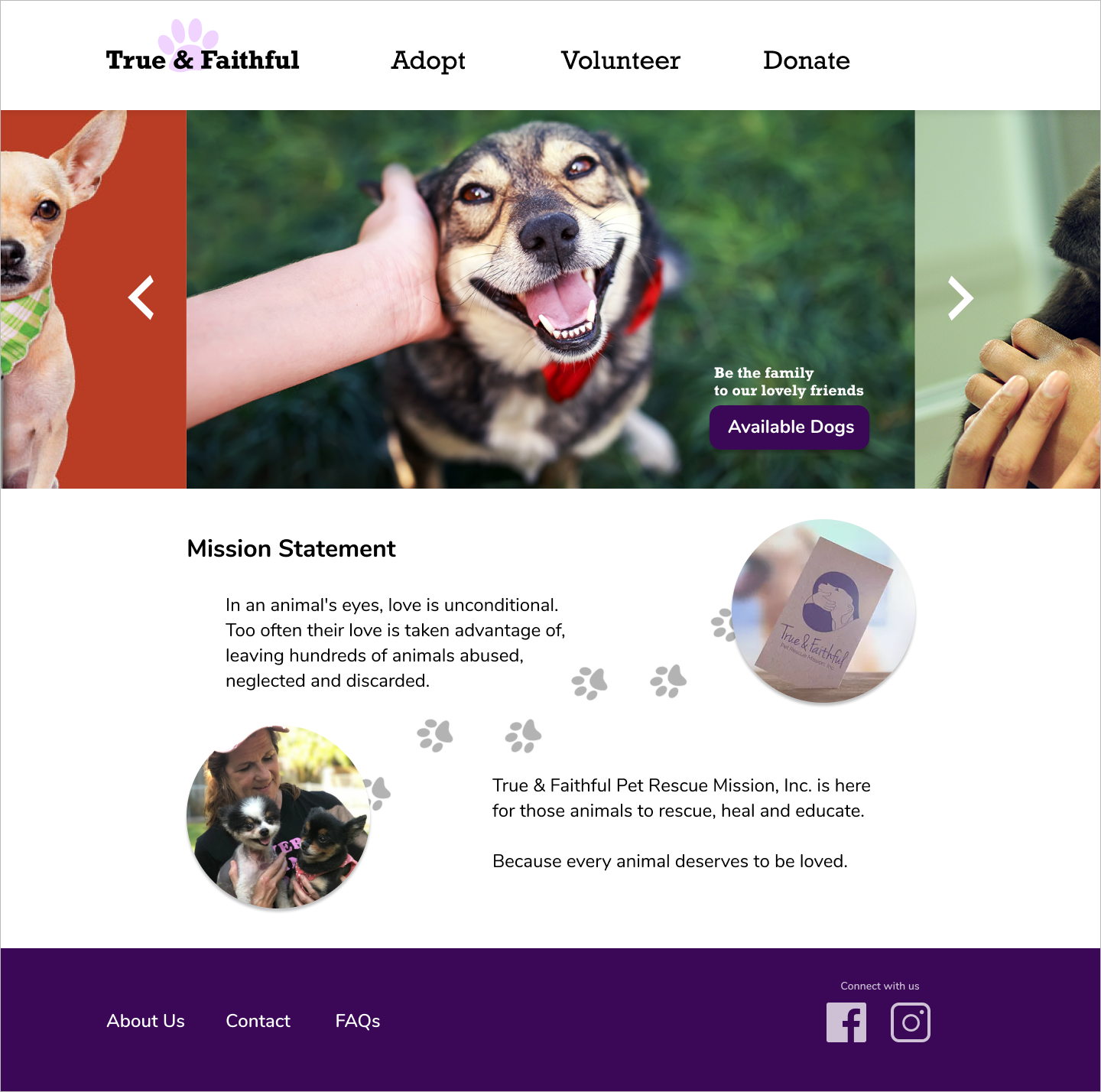
We refined our wireframe design by making it even simpler and began working on a high-fidelity prototype. The colors and graphics are reminiscent of the social media that people use to research dogs. The Homepage now has only the main carousel with a link to the Available Dogs page and the Global Navigation has been simplified to Adopt, Volunteer and Donate. When we make the design familiar and make it easier to find dogs, get information about the dogs and complete the application, then Heather is less likely to get discouraged before she finishes the process.

High-fidelity prototype mock-up of our new website design.
3 out of 3 users tested were able to complete the dog adoption process in under 5 minutes with the new high-fidelity design. The simple, easy to read layout, friendly graphics and pictures of dogs gave the prototype credibility and made it easy to navigate.
We also redesigned the original Dog Adoption Application and divided it into smaller sections to make it easier for Heather to read and complete. We made it part of the website, so it can be completed and submitted without downloading and emailing. By making the application easier to read and to complete, we can help Heather achieve her goal and we can also give the website more credibility, because now the entire application process can be completed without leaving the True and Faithful website.
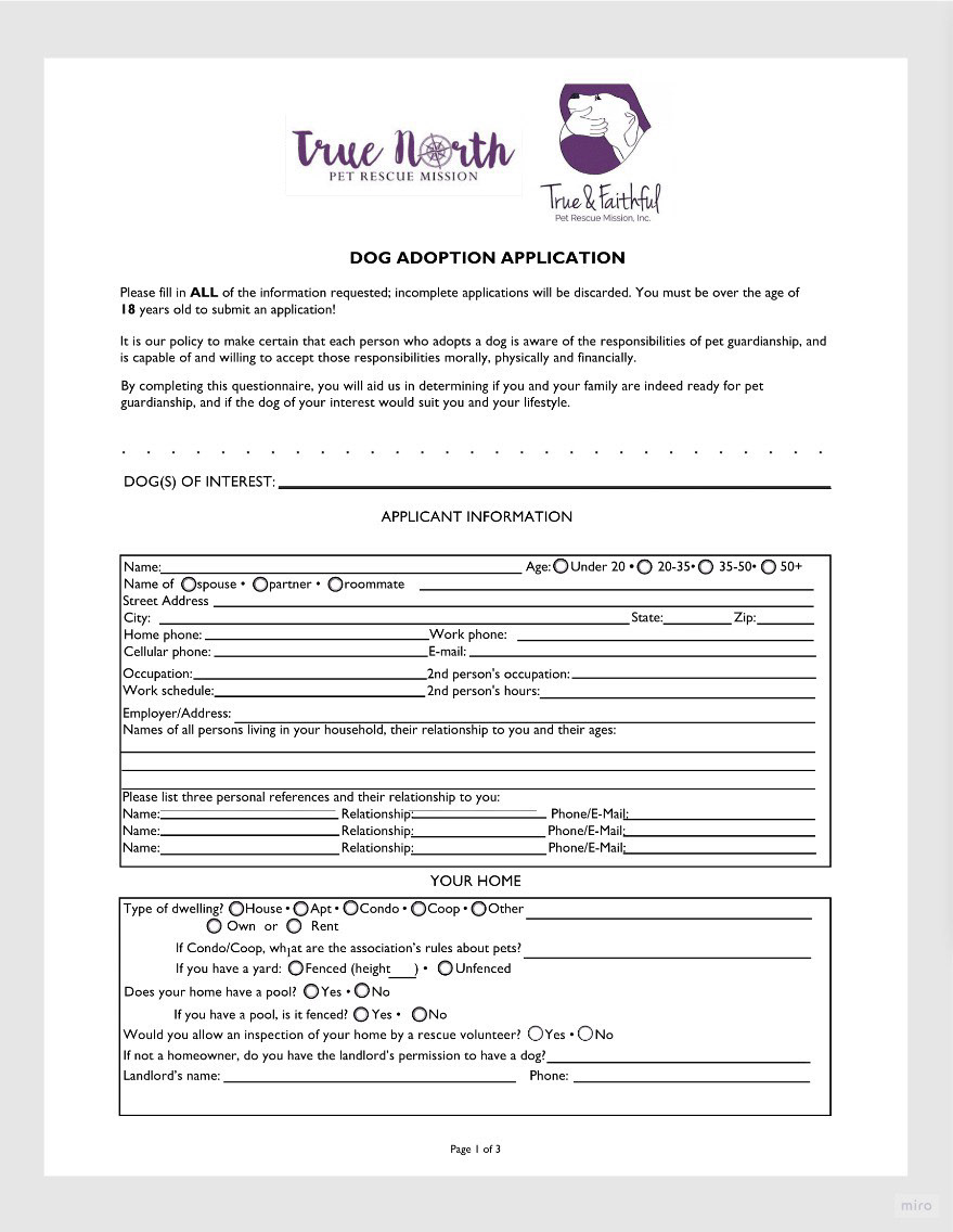
Original application.

New application.
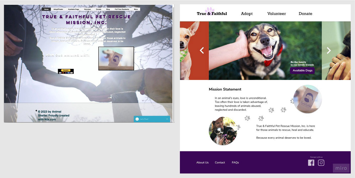
Original Homepage (left) & new Homepage (right).
Next Steps
As an academic exercise the scope of the testing was limited to just a few users. Moving forward it would be interesting to see what more user research and testing would contribute to the process of redesigning this existing website. Also, because of the limited time we had to research and design a high-fidelity prototype, we had to focus on just a few main interactions and pages, just enough to complete the application. Heather’s user journey on a prototype like this would be limited. It would be interesting to see a more complete prototype and to test it with 5–10 users so we could refine the design even more.
Finally, by researching and designing an experience that will help our Persona Heather find and adopt a dog on True and Faithful website, we have also designed a website that feels more credible and trustworthy and that is the key component to this user experience.